A Multifaceted User Control for displaying Application Settings
appdev csharp uwp usercontrol xaml settings applicationdev
A C# UWP Xaml Custom UserControl is presented that contains a range of subelements, only one of which is ever displayed. Selection is by setting an enum property type for the instance in the host Xaml page. The host Xaml page is modelled upon the HTML flow presentation style and so requires a stacked set of similar elements. One UserControl class is able to function as 8 different types of UI elements when instantiated in a host page. The types include, collapsable headings, comments, code to copy, links and textual input with labels and functional buttons
I have a UWP app , AzDeviceStreamingApp, available in The Microsoft Store and as source on GitHub. The app streams data via an Azure IOT Hub between an IoT device and a user app. (The app can actually function as both ends of the pipe, and do this simultaneously.) The app requires a range of connection settings for connectivity to the IoT Hub such as Hub and Device Connection Strings and the DeviceId. The Hub’s inbuilt Event Hub connectivity parameters are also required. In a previous blog, the saving and reloading of these app settings using Reflection was discussed. This post discusses the UI for collecting and editing the connection information, including a custom multi-functional UserControl for getting that data.
Nb: The link to the UserControl and Host pages presented here are in the last section of this page.
IoTHub Connection Settings Page
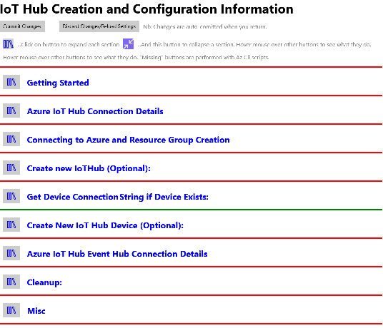
The app has an Xaml page that can be actioned when the app’s settings icon is pressed on the app main page. This settings page is very much like a web page in that there is one item per line . Line types are varied but have a specific set of types:
- Headings with expandable sections of content
- Headings
- Text content with instructions or comments.
- URLs
- Azure Cli commends that can be copied and run in a shell for generating IoT Hub resources as well as getting required connection information
- UI elements for displaying, entering, pasting and editing connection information so determined, including [Paste] buttons.
- Buttons for actioning Azure IoTHub resource generation in-app, rather than through Az Cli
- Etc

The Connection Settings Page. Only Headings showing Click to show some expanded sections
NewElement UserControl
As the page is line based, the page is implemented as a StackPanel. Lines in the UI are then stacked vertically in this panel. The lines have a varied layout and a varied collection of controls. Each line could be implemented specifically using TextBoxes, TextBlocks buttons etc. But given the list above it makes more sense to use a UserControl for each line type. It was decided though that rather than have multiple UserControls, there would be only one but with an enum property that specifies what type of line it is. The Xaml code for the UserControl then is a grid with one row and multiple columns, but with a number of one-line StackPanels or Grids (all in Row 0) containing the layout for each line type. The CodeBehind for the UserControl then sets the Visibility to Collapsed for all bar the line corresponding to the chosen enum property. There is a set of properties in the UserControl that in-line Xaml content is bound to. Rather than having specific content properties for each line type, there is a common set that is used throughout all line. Given that only one line in the UserControl is displayed, there is no overlap.

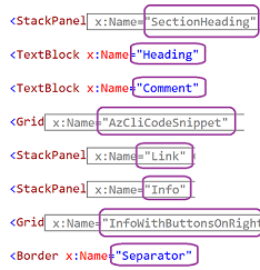
The UserControl UI. Click to expand
Note that only one of the elements is visible at a time. Hence all are on Row 0 of the Grid. Elements that are collapsed (grey) are compound. The content of the elements (in the main just text) is bound to public properties of the UserControl class. Some elements have buttons requiring an event handler. Other buttons have built in handler. (For example the button on the left of the AzClieCodeSnippet copies the code to the ClipBoard). The buttons without in-built handlers are also have delegates as class properties, as delegates the need to be implemented in teh host page’s CodeBehind. The element that is displayed for each instance of the UserControl depends upon the DisplayMode enum property value of the control (set in the host page’s Xaml )
public enum Mode
{
    sectionHeading,
    heading,
    comment,
    azCodeSnippet,
    link,
    info,
    infoWithButtonsOnRight,
    separator
}

public Mode DisplayMode { get; set; }
DisplayMode is checked in the UserControl’s PageLoaded() method to determine which element is displayed.
Note: Remember that there is an instance of this UserControl for each line of the encompassing IoTHubSettings page.*
private void Page_Loaded(object sender, RoutedEventArgs e)
{
    SectionHeading.Visibility = (DisplayMode == Mode.sectionHeading) ? Visibility.Visible : Visibility.Collapsed;
    InfoWithButtonsOnRight.Visibility = (DisplayMode == Mode.infoWithButtonsOnRight) ? Visibility.Visible : Visibility.Collapsed;
    Separator.Visibility = (DisplayMode == Mode.separator) ? Visibility.Visible : Visibility.Collapsed;
    Comment.Visibility = (DisplayMode == Mode.comment) ? Visibility.Visible : Visibility.Collapsed;
    AzCliCodeSnippet.Visibility = (DisplayMode == Mode.azCodeSnippet) ? Visibility.Visible : Visibility.Collapsed;
    AzCliCodeSnippetButton.Visibility = AzCliCodeSnippet.Visibility;
    Heading.Visibility = (DisplayMode == Mode.heading) ? Visibility.Visible : Visibility.Collapsed;
    Link.Visibility = (DisplayMode == Mode.link) ? Visibility.Visible : Visibility.Collapsed;
    Info.Visibility = (DisplayMode == Mode.info) ? Visibility.Visible : Visibility.Collapsed;
Binding UserControl Properties
The UserControl class as implemented, implements the IPropertyChanged
interface.
Various element’s control properties are bound to these properties as
the DataContext of the page is set to itself.
Most of these properties are textual and only OneWay. Only the TextBlock
Text property of InfoWithButtonsOnRight that displays connection
settings that is bound to TextInfo property is TwoWay.
For example:
<TextBlock x:Name="Comment" Text="{Binding Path=Code}" Grid.Row="0" Grid.Column="1" Grid.ColumnSpan="3" />
The relevant UserControl properties are listed below.
public partial class NewHubElement
{
    NewHubElement.Mode DisplayMode { get; set; }
    string Code { get; set; }
    string InfoValue { get; set; }
    string TextInfo { get; set; }
    string Url { get; set; }
    string UrlText { get; set; }
    string Property { get; set; }
    bool IsExpanded { get; set; }
    StackPanel SubRegion { get; set; }
    Color Color { get; set; }

    *InfoWithButtonsOnRightRegion*
}
DisplayMode: This sets the element within the UserControl that shows.
Code; The primary readonly text for most elements. Labels, comments etc.
InfoValue: PlaceHolder text for TextBox used for settings entry and display.
TextInfo: The Text in that TextBox in InfoWithButtonsOnRight (Connection Setting values)
Url: The Url for the Link mode of the UserControl
UrlText: The label for Link mode.
Property: The property of the control from the hosting page context.
IsExpanded: For SectionHeading. Determines if its SubRegion is displayed.
SubRegion: For SectionHeading. The StackPanel UI to show when main heading is expanded.
Color: The color of the Separator
InfoWithButtonsOnRightRegion: See InfoWithButtonsOnRight below
InfoWithButtonsOnRight
The element for entering and displaying the connection settings has up to four optional buttons on the right of its TextBox, Show1stButton etc. The ShowNnnButton property of the UserControl determines if the Nnn button shows in the element.

The four buttons in the InfoWithButtonsOnRight element
- The first button pastes directly to the TextBox in the InfoWithButtonsOnRight element.
- The second button is for when there is an associated Azure IoTHub resource that can be created. This requires a handler to be assigned to its CreateNewEntity delegate property.
- The third button is for optionally deleting the Azure IoTHub entity named in the element’s TextBox. Also requires a host implemented handler.
- The fourth button is for when it is possible to generate the named setting from other connection settings or using the others with the Azure SDK API. Host implemented as well.
    #region ExtraButtonsRegion
    ValueChanged CreateNewEntity { get; set; }
    ValueChanged DeleteEntity { get; set; }
    ValueChanged GenerateEntityInfo { get; set; }
    Visibility Show1stButton { get; set; }
    Visibility Show2ndButton { get; set; }
    Visibility Show3rdButton { get; set; }
    Visibility Show4thButton { get; set; }
    #endregion
}
Links to the Xaml and CodeBehind pages
On GitHub
- The UserControl
- The Host Page
| Topic | Subtopic | |
| Next: > | AzureAdventCalendar | Azure IoT Hub Super Quickstart in 5 minutes! |
| This Category Links | ||
| Category: | Application Dev Index: | Application Dev |
| Next: > | GitHub is now free for Teams | |
| < Prev: | Saving and Loading C# Application Settings through Reflection |


